How We Built a High-Converting Security Website That Actually Sells
A developer’s breakdown of specializedsecurity.ai — and why every decision was intentional
When Specialized Security Corporation came to us, they had a serious product and a forgettable web presence. They needed a site that could carry the weight of an enterprise B2B sales conversation — one that would speak to property managers, apartment complex owners, and real estate developers who were tired of being burned by AI-only security systems that cry wolf.
The challenge wasn’t just visual. It was architectural, copywriting-driven, and deeply strategic. Here’s how we approached it — and the specific decisions we made that any serious web development partner should be making for their clients.
1. Start With the Sales Funnel, Not the Homepage
The first question we asked wasn’t “what should the homepage look like?” It was: “What does a property manager need to believe before they’ll pick up the phone?”
The answer shaped everything:
- This company is credible and established
- Human monitoring beats AI-only systems — the core differentiator, repeated and reinforced
- This scales to my property’s needs — whether 50 units or 500
- I can trust these people — veteran-owned, mission-driven, transparent
Every page, every section, every CTA was architected around moving a prospect through those four belief checkpoints. The homepage establishes credibility. The services page overcomes objections. The about page builds trust. The why choose us page closes.
This is how conversion-focused web development works. Not “make it pretty” — make it persuade.
2. The Hero Section: One Job, Done Well
The homepage opens with a full-screen video background — real footage of security monitoring in action — overlaid with a single, declarative headline:
Live Remote Monitoring. That Protects Properties 24/7.
No tagline soup. No jargon. No five-word brand promises stacked on top of each other.
From a technical standpoint, the hero video is served as an optimized MP4 with autoplay, muted, and looped — a pattern that consistently outperforms static imagery for security, tech, and operational service businesses. It communicates “we are always running” without saying a word.
Below the headline, three trust signals fire immediately: Veteran-Owned · Live Operators · Proactive Security — short, scannable, and substantive. Then the CTA: Free Security Assessment. Not “Get a Quote.” Not “Contact Us.” A free assessment — a low-barrier, high-value offer that fits the long B2B sales cycle of this industry.
The developer takeaway: Your hero section has one job — stop the scroll and earn the next ten seconds. If it’s trying to do more than that, it’s doing less than it should.
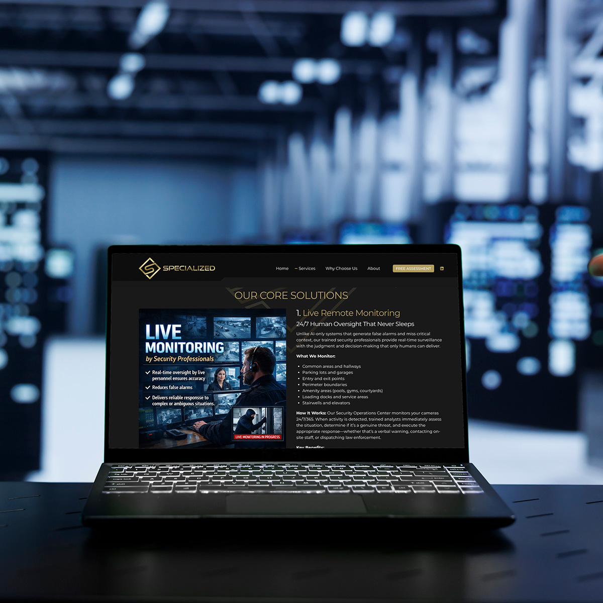
3. Service Architecture: Building for Complex Products
Specialized Security offers five distinct services that work together as a system. Most agencies would slap them in a grid with icons and call it a day. We built it as a layered educational experience.
Each service block on the Services page follows a consistent structure:
- What it is (plain-language summary)
- What we monitor/capture/control (specificity builds credibility)
- How it works (removes mystery, reduces sales friction)
- Key benefits (quantified where possible — 95% reduction in false alarms, under 60 seconds average response time)
This structure is intentional. Enterprise buyers research deeply. They forward links to colleagues. They come back three times before reaching out. A shallow services page loses them on visit two. A page built for education and re-engagement converts them on visit three.
We also included three integrated use-case scenarios — Unauthorized Vehicle Entry, Banned Individual Returns, Package Theft Prevention — that walk through exactly how the systems work in concert. This kind of scenario-based content does something most service pages never attempt: it lets the prospect see themselves in the solution.
The developer takeaway: Complex products need layered content architecture, not flat page structures. Build for the research phase, not just the first impression.
4. The Tiered Pricing Section: Clarity That Converts
We built four clearly defined service packages — Essential, Professional, Premium, and Custom — each mapped to a specific property type and unit count.
This might seem straightforward. It isn’t. Most B2B service companies resist publishing packages because they fear it limits negotiation. What they’re actually doing is forcing every prospect to send an email before they understand what they’re buying — and most prospects never send that email.
By publishing packages with transparent scope and clear target audiences (“Best For: Small apartment complexes, 50–100 units”), we let prospects self-qualify. The right people reach out with context. The sales conversation starts warmer and moves faster.
The developer takeaway: Pricing transparency isn’t just a design choice — it’s a pipeline strategy. Package clarity reduces friction, improves lead quality, and shortens sales cycles.
5. The About Page: Turning a Backstory Into a Competitive Moat
This was one of the most strategically important pages on the site, and it required real editorial judgment to execute.
Founder Dane Stordahl’s story — 4 years in the U.S. Marine Corps, two deployments to Iraq, 13 years in law enforcement as a K-9 handler — is genuinely exceptional. But backstory alone doesn’t convert. We had to connect that biography directly to product superiority.
The sequence we wrote:
- The Problem He Saw — security companies relying too heavily on technology, missing genuine threats, failing when human judgment was needed most
- The Vision He Had — combine advanced tech with trained human oversight
- The Results He Achieved — 250+ cameras, four active sites, 100% client retention
That’s not a biography. That’s a proof of concept narrative — and it’s one of the most powerful sales tools a founder-led company can deploy.
We also went unusually deep on the Security Analysts section: hiring standards, the 80-hour training program, a maximum of 15 cameras per analyst versus the industry standard of 25–30. Most companies hide their operational details. We put them front and center, because in a trust-deficit industry, radical transparency is a competitive advantage.
The developer takeaway: About pages that convert don’t just tell a company’s story. They use that story to explain why the product works better. Biography is table-setting. Operational credibility is the close.
6. Design Language: Authority Without Aggression
The visual system we built centers on a deep, near-black primary palette with gold accents — commanding and premium without tipping into the aggressive visual language some security brands default to.
Section transitions use layered diagonal imagery and custom divider graphics to create movement and depth throughout a long-scroll page. The result is a site that feels dynamic and production-quality without relying on heavy JavaScript frameworks or performance-killing animations.
Typography was chosen for authority and legibility at scale — bold, clean, and at home on large-format displays where property managers and building operators are most often working.
Every image selection was intentional: live monitoring operations, access control hardware, real property environments — not stock photography of smiling security guards.
The developer takeaway: Design language is brand communication, not decoration. Every visual choice either reinforces the brand story or dilutes it.
7. Mobile Optimization for a Desktop-Primary Audience
Here’s a nuance worth noting: Specialized Security’s primary buyers — property managers, building operators, asset managers — predominantly research on desktop. We built mobile-responsively (always), but the hierarchy, type sizing, and content depth were calibrated for a desktop-first audience.
Not every website needs to prioritize mobile. Understanding your buyer’s device behavior is foundational to correct development prioritization. We see too many agency builds that compress and simplify desktop content for a mobile-first ideology when the data doesn’t support it.
The developer takeaway: Responsive isn’t a one-size-fits-all doctrine. Understand your audience’s behavior before you decide which experience deserves the most optimization effort.
The Outcome
A website that functions as a 24/7 sales representative — educating prospects, building trust, handling objections, and surfacing the right CTA at the right moment throughout the buyer journey.
Specialized Security now has a digital presence that matches the quality and credibility of their operations. For a company preparing to expand from a strong Southern California base to a national footprint, that foundation matters enormously.
Why This Matters for Your Business
If you’re running a service company — especially one in an industry where trust, credibility, and technical expertise are the core purchase drivers — your website isn’t a brochure. It’s your highest-volume sales conversation, happening without you, at all hours.
The difference between a website that generates leads and one that doesn’t isn’t budget. It’s strategic intent behind every decision — the funnel architecture, the content depth, the proof points, the CTA positioning, the design language, the platform choices.
That’s what we bring to every project at The X Concept.
Work With Us
We build websites that sell — for companies that are serious about growth.
Whether you’re launching a new brand, rebuilding an underperforming site, or scaling into a new market, we bring the same strategic and technical depth we delivered for Specialized Security to every engagement.
→ Start a Project with The X Concept
The X Concept is a web design and development studio specializing in conversion-focused websites, brand identity, and digital strategy for service businesses, B2B companies, and mission-driven brands.
See the work: specializedsecurity.ai
By Charles Oreve – The X Concept | Web Design & Development | March 2026