Why Healthcare Websites Matter: A Developer’s Journey Building Green Tree Wellness ECM
In my 24 years of building websites for businesses across industries, I’ve learned one fundamental truth: a website is never just a website. It’s a bridge between a service and the people who desperately need it. But nowhere is this more critical; and more impactful; than in healthcare. Recently, The X Concept had the privilege of developing a comprehensive website for Green Tree Wellness, a provider of Enhanced Care Management (ECM) services for Medi-Cal members in San Diego and Riverside Counties. This wasn’t just another project in our portfolio. This was an opportunity to create a digital lifeline for some of California’s most vulnerable populations; people experiencing homelessness, managing chronic illnesses, struggling with substance use, navigating mental health crises, and facing barriers that most of us can’t imagine.
As I reflect on this project, I want to share why healthcare websites are fundamentally different, why they matter so profoundly, and what we learned about building digital experiences that can literally change, and save, lives.
The Stakes Are Different in Healthcare
When we build a website for a law firm, real estate company, or e-commerce business, we’re focused on conversion optimization, lead generation, and ROI. These metrics matter, and they’re important to our clients’ success. But when we build for healthcare providers, especially those serving vulnerable populations, the stakes are exponentially higher.
Consider this: the person visiting Green Tree Wellness’s website might be:
- Sitting in an emergency room after their fourth visit this month, wondering why they can’t stay healthy
- Living in their car, trying to manage diabetes without a stable place to store insulin
- Recently released from incarceration, desperate to find mental health support before a crisis hits
- A single mother with a high-risk pregnancy, overwhelmed by medical appointments she can’t get to
- Someone who just discovered they have a chronic condition and has no idea how to navigate the healthcare system
For these visitors, the website isn’t just information; it’s hope. It’s the difference between continuing to fall through the cracks or finding someone who will walk alongside them through the most challenging period of their lives.
When the phone rings at Green Tree Wellness because someone found their website and filled out the intake form, that’s not just a lead. That’s a human being who found a path forward.
The Challenge: Making Complexity Feel Simple
Enhanced Care Management is, by its nature, complex. It’s governed by California’s CalAIM initiative, involves coordination with multiple health plans (Kaiser Permanente, Molina Healthcare, IEHP), serves 10+ distinct populations of focus, and provides seven core service elements plus 15+ community supports.
Try explaining that to someone who:
- Might have limited health literacy
- Could be in crisis
- May not have stable internet access
- Might be viewing on a cracked phone screen with spotty reception
- Could speak English as a second language
- Might have never heard of “care coordination” or “CalAIM”
The challenge wasn’t just to present information; it was to make hope accessible.
From a technical and UX perspective, this meant:
1. Radical Simplification Without Losing Depth
We structured the site to answer the most critical questions immediately:
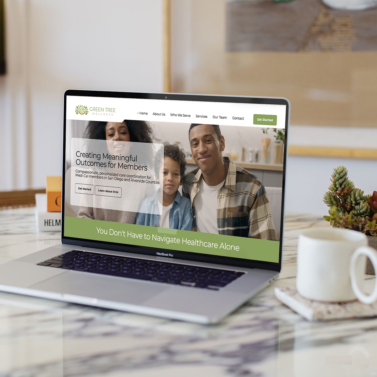
- “What is this?” (Homepage hero: “You don’t have to navigate healthcare alone”)
- “Am I eligible?” (Clear, visual presentation of populations of focus)
- “What will you do for me?” (Concrete examples, not abstract concepts)
- “How do I start?” (Prominent CTAs leading to a simple intake form)
But we also needed depth for providers, health plan partners, and people who wanted comprehensive information. The architecture had to serve both needs simultaneously; simple on the surface, detailed when you need it.
2. Language That Doesn’t Judge or Intimidate
Healthcare websites often fall into one of two traps: they’re either so clinical and jargon-filled that they’re impenetrable, or they’re so simplified that they feel condescending.
We spent considerable time crafting language that was:
- Clear but not simplistic: “We help you schedule appointments, arrange transportation, and coordinate with your doctors” instead of “comprehensive care coordination services”
- Empowering, not paternalistic: “Together, we’ll create a plan” instead of “We will provide you with a care plan”
- Honest about challenges: Acknowledging that “navigating healthcare can be overwhelming” validates people’s experiences
- Focused on partnership: “You’re not alone” repeated throughout, because that’s the core promise
3. Mobile-First, Always
According to the Pew Research Center, lower-income Americans are significantly more likely to be smartphone-dependent for internet access. Many of Green Tree Wellness’s potential members don’t have laptops or stable home internet—their phone is their lifeline.
Every decision we made prioritized mobile experience:
- Click-to-call functionality on every phone number
- Forms optimized for thumb-typing
- Minimal data usage (compressed images, optimized code)
- Readable text without zooming
- Large, easy-to-tap buttons
- Progressive disclosure (expandable sections) to reduce scrolling
4. Accessibility as a Moral Imperative
WCAG 2.1 AA compliance isn’t just a legal requirement for healthcare websites—it’s a moral imperative. Many ECM-eligible individuals have disabilities that make standard web navigation difficult or impossible.
We implemented:
- Proper semantic HTML for screen readers
- Sufficient color contrast (4.5:1 minimum)
- Keyboard-navigable forms
- Alt text on every image
- Clear heading hierarchy
- Focus indicators
- ARIA labels where needed
But beyond technical compliance, we thought about cognitive accessibility:
- Chunking information into digestible pieces
- Using icons and visual cues to aid understanding
- Providing multiple ways to accomplish the same task (call, form, email)
- Writing at an 8th-grade reading level without being condescending
The Technical Foundation: Why WordPress Still Wins for Healthcare
After building hundreds of websites on virtually every platform available, we chose WordPress with the Bold Themes Avantage theme for Green Tree Wellness. Here’s why this stack made sense for healthcare:
Security and HIPAA Considerations
While the public-facing website doesn’t collect Protected Health Information (PHI) directly, the intake form collects data that requires careful handling. WordPress, when properly configured, offers:
- SSL encryption for all data transmission
- HIPAA-compliant form plugins (WPForms with HIPAA addon)
- Regular security updates through managed hosting
- Access controls for staff managing submissions
- Encrypted storage for form submissions
- Audit trails for compliance
Speed and Performance
For users on slow connections or limited data plans, every kilobyte matters. We optimized:
- Image compression (WebP format where supported, aggressive compression)
- Lazy loading (images load as you scroll)
- Minified CSS and JavaScript
- CDN integration for faster asset delivery
- Caching strategies to reduce server load
Result: The site loads in under 2 seconds on 3G connections; critical for users with limited connectivity.
Content Management for Non-Technical Staff
Green Tree Wellness staff needed to be able to:
- Update team member profiles when coordinators join or leave
- Add community resources as partnerships develop
- Update phone numbers or hours
- Publish blog posts about health topics
- Add success stories (anonymized and HIPAA-compliant)
WordPress’s intuitive interface means they can do all of this without calling us for every minor change. This reduces costs and empowers the organization.
Scalability for Growth
As Green Tree Wellness grows; potentially adding counties, health plan partnerships, or service lines—the WordPress architecture we built can scale:
- Additional county team pages follow the same template
- New service pages integrate seamlessly
- Multilingual capability (WPML plugin) ready to implement
- Integration possibilities with CRM systems for referral tracking
The Intake Form: Where Technology Meets Human Need
If the website is the bridge, the intake form is the point where someone takes their first real step toward help. This is where technical decisions have the most profound human impact.
Balancing Thoroughness with Simplicity
ECM eligibility is complex. We needed to collect:
- Personal information
- Medi-Cal and health plan details
- Contact preferences
- Populations of focus criteria
- Current challenges and needs
- Consent and authorization
But we also knew that long forms have high abandonment rates, especially on mobile. Our solution:
Progressive Disclosure with Clear Purpose
Each section of the form explains why we’re asking:
- “Why we need this: To verify your Medi-Cal eligibility”
- “This helps us: Match you with the right Care Coordinator”
Optional Fields Where Possible
We marked only truly essential fields as required. Don’t know your Medi-Cal ID number? That’s okay—we can look it up. Unsure which health plan you have? We’ll help you figure it out.
Validation That Helps, Not Punishes
Error messages are friendly and specific:
- “Error: Invalid input”
- “Please enter your phone number in this format: (555) 555-5555”
Privacy and Trust
For populations that have experienced discrimination, surveillance, or system failures, trust is fragile. Every element of the form was designed to build confidence:
- Clear privacy notice before the form begins
- Explicit consent checkboxes (no pre-checked boxes)
- Transparent data use: “We only share your information with your health plan to verify eligibility”
- Voluntary language: “ECM services are completely voluntary; you can opt out at any time”
- Security indicators: SSL padlock, “Secure Form” messaging
Immediate Confirmation
The moment someone submits the form:
- Confirmation page with reference number and clear next steps
- Automated email confirming receipt and setting expectations
- Crisis resources if they need immediate help
- Timeline transparency: “A Care Coordinator will contact you within 1-2 business days”
This immediate feedback is psychologically crucial. When you’re in crisis or desperately need help, submitting a form into the void is terrifying. Immediate confirmation says: “We received this. You matter. Help is coming.”
The Impact of Design: Why Aesthetics Matter in Healthcare
There’s a dangerous myth in healthcare and social services that “nice design” is frivolous—that what matters is the substance, not the style. This is completely wrong, especially for vulnerable populations.
Design communicates value.
When someone who has been homeless, justice-involved, or struggling with addiction visits a website, they’ve often experienced being treated as less-than. They’ve encountered systems that are hostile, confusing, or indifferent.
A thoughtfully designed website sends a powerful message: “You deserve quality. You deserve attention to detail. You matter.”
For Green Tree Wellness, this meant:
Professional Photography and Imagery
We recommended professional headshots for all Care Coordinators. Why? Because when someone is deciding whether to trust you with their healthcare, seeing a warm, professional photo of an actual human being makes all the difference.
Stock photos of generic medical situations were avoided. They feel impersonal and don’t reflect the diverse communities Green Tree Wellness serves.
Color Psychology
We used calming greens and blues; colors associated with growth, healing, and trust. We avoided harsh reds or aggressive color schemes that can subconsciously trigger stress responses.
White Space and Breathing Room
Dense, cluttered layouts feel overwhelming. Generous white space signals: “We have time for you. We’re not rushing you. Take your time understanding this.”
Consistent, Intuitive Navigation
People in crisis don’t have cognitive bandwidth for complicated navigation. Every page follows the same structure. Important information (phone number, “Get Started” button) is always visible.
Compliance: The Unsexy Foundation That Protects Everyone
Healthcare websites operate under more regulatory scrutiny than almost any other industry. These requirements aren’t bureaucratic annoyances—they protect vulnerable people from discrimination and ensure equitable access.
Federal Requirements We Built In
Title VI (Civil Rights Act): No discrimination based on race, color, or national origin
Section 504 (Rehabilitation Act): No discrimination based on disability
Section 1557 (ACA): No discrimination based on sex, including gender identity
Limited English Proficiency (LEP) Requirements: Language assistance notices
The footer includes the full nondiscrimination statement in multiple languages—not buried in a PDF, but visible on every page. This isn’t just legal compliance; it’s a promise to communities that have experienced discrimination.
California-Specific Requirements
CalAIM compliance: Accurate representation of ECM services
Medi-Cal beneficiary rights: Clear information about grievance procedures
Health plan coordination: Proper attribution to partner health plans
HIPAA Considerations
While the public website doesn’t contain PHI, the intake form required:
- Secure transmission (SSL/TLS encryption)
- Encrypted storage
- Access controls
- Business Associate Agreements with form providers
- Clear privacy notices
Measuring Success: Metrics That Matter
For most websites, success metrics are straightforward: traffic, conversions, bounce rate, time on site. For Green Tree Wellness, we’re measuring something more profound.
Traditional Metrics
Yes, we track:
- Form submissions
- Click-through rates on CTAs
- Page views on eligibility information
- Mobile vs. desktop traffic
- Average session duration
Human-Centered Metrics
But we also care about:
- Time to first contact: How quickly does someone go from form submission to speaking with a Care Coordinator?
- Completion rates: Are people completing the intake form, or abandoning it?
- Accessibility usage: Are people using screen readers successfully navigating the site?
- Phone calls: Is the click-to-call feature being used?
- Return visits: Are people coming back to the resources page, suggesting they find it valuable?
The Ultimate Metric: Lives Changed
The true measure of this website’s success isn’t technical—it’s human. When Green Tree Wellness enrolls a member who found them through the website, and that person:
- Gets their chronic condition under control
- Finds stable housing
- Avoids another ER visit
- Successfully transitions from incarceration
- Delivers a healthy baby despite high-risk complications
- Gets connected to mental health treatment that saves their life
That’s when we know the website worked.
Lessons for Healthcare Web Development
After building this site, here are the principles I believe should guide every healthcare website project:
1. Empathy Is the Most Important Design Tool
Before writing a single line of code, spend time understanding your users. For Green Tree Wellness, this meant understanding what it’s like to:
- Navigate healthcare while experiencing homelessness
- Manage chronic illness without stable transportation
- Trust a system after it’s failed you before
- Ask for help when you’re at your most vulnerable
Every design decision should be filtered through this lens of empathy.
2. Accessibility Is Not Optional
It’s not enough to meet WCAG AA standards (though that’s essential). Ask: Can someone with cognitive impairments understand this? Can someone with limited tech literacy navigate it? Can someone on a five-year-old phone with a cracked screen and slow connection use it?
3. Clarity Always Wins
In healthcare, people’s lives depend on understanding information correctly. When in doubt, be clearer. Cut jargon ruthlessly. Test copy with people who aren’t healthcare experts.
4. Build Trust Through Transparency
Vulnerable populations have often been lied to or let down by systems. Be honest about:
- What you can and cannot do
- How long things will take
- Who will see their information
- What happens if they change their mind
5. Mobile Is Primary, Desktop Is Secondary
This is true for most sites now, but it’s absolutely critical in healthcare. Your users are probably on phones, possibly with poor connections and limited data. Design for that reality first.
6. Speed Is a Feature, Not a Luxury
When someone is in crisis and looking for help, every second matters. A slow website can mean they give up and don’t get help. Optimize ruthlessly.
7. Form Design Is UX Design
Your intake form might be the most important page on your site. It deserves as much attention as your homepage. Test it with real users. Reduce friction everywhere you can.
8. Crisis Resources Should Be Omnipresent
If someone arrives at your site in crisis, they shouldn’t have to hunt for help. Crisis hotlines should be visible on every page, in the header and footer, in large, easy-to-tap buttons.
9. Compliance Protects People, Not Just Organizations
Don’t think of legal requirements as boxes to check. They exist because people were harmed and laws were created to prevent it from happening again. Embrace them as guardrails that protect your users.
10. Content Is Care
The words on your website are an extension of your care. Write them with the same compassion you’d bring to an in-person conversation with someone who’s struggling.
The Business Case: Why Healthcare Orgs Should Invest in Websites
I know that many healthcare organizations, especially nonprofits and community-based providers, operate on tight budgets. Website development can seem like a luxury when resources are scarce.
But here’s the reality: A good website is not a cost; it’s a force multiplier.
It Extends Your Reach
Green Tree Wellness has Care Coordinators in two counties. But their website reaches everyone with internet access in those counties; 24/7, in multiple languages, without requiring additional staff.
It Pre-Qualifies Referrals
The intake form helps people self-identify whether they meet eligibility criteria. This means staff spend less time on phone calls with people who don’t qualify, and more time supporting people who do.
It Reduces Repetitive Questions
A comprehensive FAQ and resources section means staff answer fewer basic questions by phone and email, freeing them up for complex case management.
It Builds Credibility
A professional website signals legitimacy. For potential funders, health plan partners, and referring providers, it demonstrates organizational capacity and professionalism.
It Provides 24/7 Access
Mental health crises don’t happen only between 9-5. Someone might search for help at 2 AM. Your website is there, providing information and hope, even when your office is closed.
It Reduces Barriers
For someone who has transportation challenges, social anxiety, or limited availability during business hours, a website allows them to learn about services and apply for help on their own terms.
The ROI Is Measurable
Track:
- Cost per acquisition (form submissions)
- Reduction in staff time handling basic inquiries
- Increase in qualified referrals
- Improved health plan partner relationships
- Grant opportunities that require digital presence
For Green Tree Wellness, if the website generates even 10 additional qualified enrollments per year, and each enrolled member receives services valued at tens of thousands of dollars in care coordination and improved health outcomes, the ROI is substantial.
The Broader Impact: Healthcare Equity and Digital Access
The Green Tree Wellness website is a small piece of a much larger puzzle: health equity in the digital age.
The Digital Divide in Healthcare
We talk a lot about the digital divide in terms of education and economic opportunity. But there’s a profound healthcare digital divide:
- Lower-income Americans are more likely to rely on smartphones and to have inconsistent internet access
- People with disabilities face barriers on inaccessible websites
- Limited English Proficient (LEP) individuals encounter sites only in English
- People with limited health literacy struggle with medical jargon
- Rural populations deal with slow internet speeds
Healthcare websites can either reinforce these disparities or help bridge them. When we build sites that are accessible, mobile-optimized, available in multiple languages, and written in plain language, we’re actively working toward health equity.
Digital Front Doors to Care
During COVID-19, we saw healthcare organizations rapidly embrace telehealth. Many discovered that digital access to care could reduce barriers for patients who faced transportation challenges, childcare constraints, or mobility issues.
But telehealth is just one aspect of digital healthcare access. The “digital front door”; the first point of contact someone has with a healthcare organization; is increasingly a website or online form.
When that digital front door is well-designed, secure, and accessible, it welcomes people in. When it’s confusing, broken, or exclusionary, it becomes another barrier in a healthcare system already full of barriers.
The Role of Technology in Care Coordination
Enhanced Care Management is fundamentally about coordination; connecting people to resources, providers to each other, and members to supports. Technology should facilitate this coordination, not complicate it.
For Green Tree Wellness, future enhancements might include:
- Member portals where enrolled members can message their Care Coordinator, view appointments, and access resources
- Provider portals for referring physicians to check on their patients’ ECM enrollment
- Resource databases that Care Coordinators can search to find community supports
- Outcome tracking to measure member progress toward goals
The website we built is the foundation for these future capabilities.
A Personal Reflection: Why This Work Matters
I’ve been building websites for 24 years. I’ve created sites for law firms where I helped lawyers attract high-value clients. I’ve built e-commerce platforms that generated millions in revenue. I’ve designed real estate sites that helped agents close deals.
All of that work mattered. All of it was valuable to my clients. And I’m proud of it.
But building the Green Tree Wellness website felt different.
When I think about someone experiencing homelessness finding that site on a library computer or a friend’s phone… when I imagine a person with a chronic illness finally discovering that help is available… when I picture someone in recovery seeing that “substance use disorder” is listed without judgment as a reason to qualify for support… I’m reminded why I got into this field in the first place.
Technology, at its best, connects people to possibilities.
In healthcare, those possibilities can be profound: better health, improved quality of life, prevention of crises, connection to community, hope for the future.
The Responsibility of Healthcare Web Developers
We have a responsibility that goes beyond code and design. When we build healthcare websites, we’re creating infrastructure that people rely on during the most vulnerable moments of their lives.
That means:
- Testing more thoroughly
- Thinking more carefully about accessibility
- Writing more clearly
- Designing more empathetically
- Caring more deeply about outcomes
It means recognizing that if we build something beautiful but inaccessible, we’ve failed. If we create something that works perfectly on a MacBook Pro but breaks on a budget Android phone, we’ve failed. If we use language that requires a college degree to understand, we’ve failed.
Our standard must be: Will this work for the person who needs it most?
For Healthcare Organizations: Questions to Ask Your Web Developer
If you’re a healthcare organization considering a website project, here are questions you should ask any developer or agency you’re considering:
- Do you have experience with healthcare compliance requirements?
(HIPAA, accessibility standards, nondiscrimination notices) - How will you ensure the site works for people with limited internet access?
(Mobile optimization, speed, data usage) - What’s your approach to accessibility?
(Ask for specific examples, not just “we follow WCAG”) - How do you handle form security and data protection?
(Encryption, storage, HIPAA-compliant plugins) - Can you show examples of healthcare or nonprofit sites you’ve built?
(Look for evidence they understand the unique needs) - How do you approach writing for healthcare audiences?
(Plain language, health literacy considerations) - What’s your process for user testing with diverse populations?
(Do they test with actual users who represent your target populations?) - How will you handle language accessibility?
(Multi-language support, interpreter services information) - What’s included in ongoing maintenance and support?
(Security updates, compliance monitoring, content updates) - Can you integrate with our existing systems?
(CRM, EHR, health plan portals, referral management)
For Fellow Developers: Resources and Recommendations
If you’re a web developer interested in healthcare projects, here are resources that helped me:
Learn Healthcare Basics
- CMS.gov – Understanding Medicare/Medicaid
- CalAIM documentation – California-specific initiative (if working in CA)
- Health literacy guidelines – CDC and NIH resources
Technical Standards
- WCAG 2.1 AA – Web Content Accessibility Guidelines
- Section 508 – Federal accessibility standards
- HIPAA Technical Safeguards – If handling PHI
- OCR Guidance – Office for Civil Rights compliance resources
Design Resources
- PlainLanguage.gov – Writing for government/healthcare
- Healthcare.gov – Study their UX patterns
- CDC Clear Communication Index – Health communication guidelines
Conclusion: The Website That Connects People to Care
The Green Tree Wellness website represents more than code, design, and content. It’s a bridge between isolation and support, between confusion and clarity, between crisis and care.
Every element; from the welcoming hero image to the carefully crafted intake form, from the accessible navigation to the multilingual footer; was designed with one purpose: to help people who need care find it, understand it, and access it.
This is what healthcare web development should be.
Not flashy for the sake of flash. Not clever for the sake of cleverness. But thoughtful, accessible, empathetic, and focused on outcomes that matter: human health and wellbeing.
At The X Concept, we’ve built hundreds of websites. But the ones that keep me awake at night—in the best way—are the ones like this. The ones where I know that somewhere in San Diego or Riverside County, someone in need is finding hope through a website we built.
That’s not just good web development. That’s technology in service of humanity. And that’s the work worth doing.
By Charles Oreve, Founder of The X Concept
About The Author:
Charles Oreve is the founder of The X Concept, a full-service digital marketing agency based in San Diego, California. Since 2001, Charles has been creating websites and digital strategies that help businesses and organizations achieve their goals. He specializes in WordPress development, AI-powered SEO, and creating accessible, user-centered digital experiences. When not building websites, Charles is passionate about using technology to address social challenges and improve access to critical services.
The X Concept serves clients across industries including healthcare, law, real estate, and small business. For more information about our work or to discuss your next project, visit thexconcept.com or schedule a consultation.
Related Articles:
- WordPress vs. Other CMS Platforms: A Complete Comparison
- AI-Powered SEO: How Machine Learning Is Changing Digital Marketing
- Email Marketing That Converts: Case Studies and Strategies
Have a healthcare website project? Let’s talk about how we can create a digital experience that truly serves your mission and your community.